Orange is the new Blue
Ever since Microsoft Windows days the blue color was the dominant hue used in user interfaces. Blue is considered to be comfortable on the eyes, especially when used as background and other large surfaces in the user interfaces.
In HTML, the default link color is also blue. It’s distinguishable from the default black while still possessing the “blue” qualities of being easy on the eyes.
But in the last year or so I notice following trend:

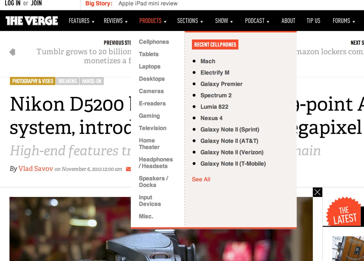
Several prominent publications had designed or redesigned their sites to use a darker shade of orange as the main emphasis and link color. The Verge, The Next Web and Ars Technica are now all look similar, as far as their main color palette goes:


Don’t get me wrong. I actually do like the new designs. I especially love the design on The Verge. It was the first site where I saw orange used prominently. I think other have followed, though I believe that Ars used the orange cycle in its logo for a long time and some of its elements were orange then, but the new design is much heavier on the color. Same with The Next Web. I believe it had more red colors in its old design and certainly not so much of orange.
I wonder if other big sites will follow this trend:

