-
Orange is the new Blue
Ever since Microsoft Windows days the blue color was the dominant hue used in user interfaces. Blue is considered to be comfortable on the eyes, especially when used as background and other large surfaces in the user interfaces.
In HTML, the default link color is also blue. It’s distinguishable from the default black while still possessing the “blue” qualities of being easy on the eyes.
But in the last year or so I notice following trend:
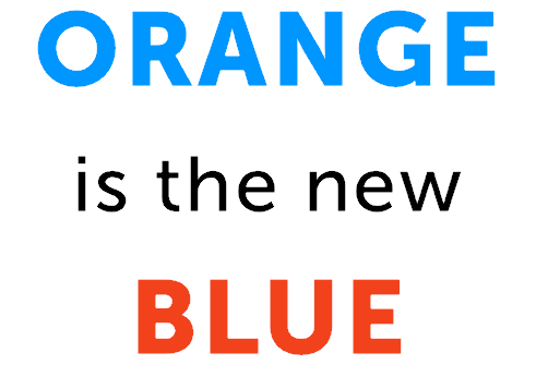
Several prominent publications had designed or redesigned their sites to use a darker shade of orange as the main emphasis and link color. The Verge, The Next Web and Ars Technica are now all look similar, as far as their main color palette goes:
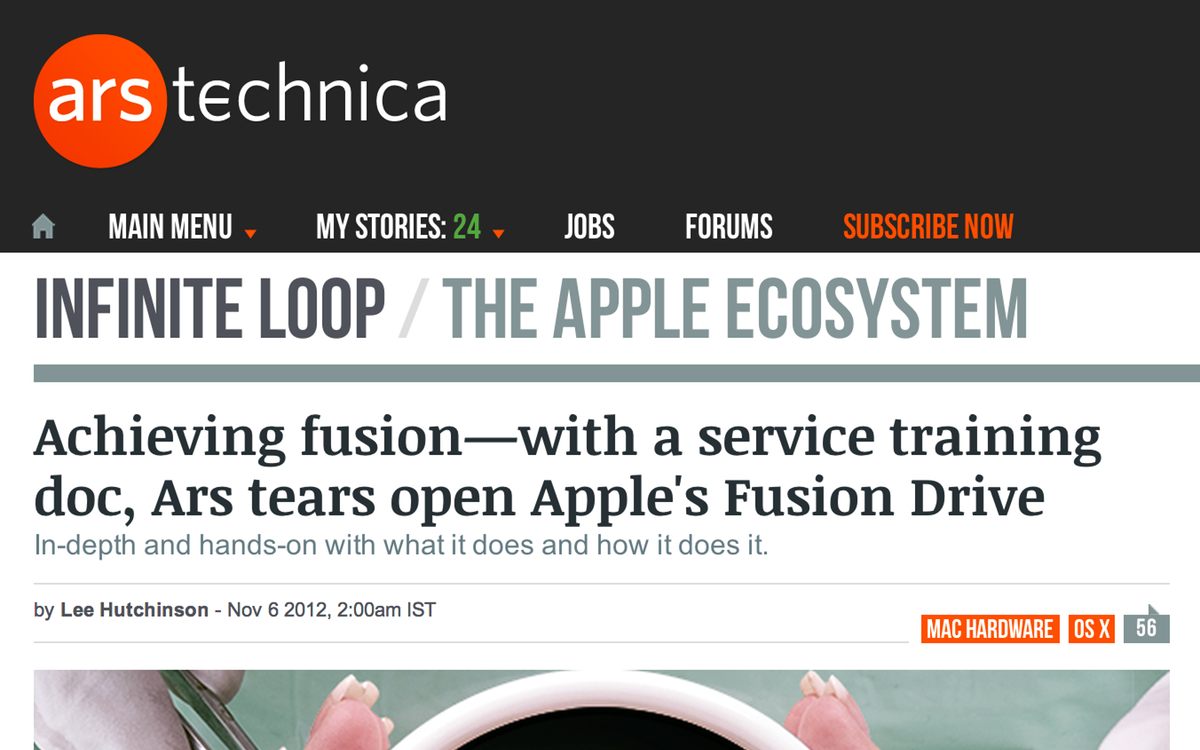
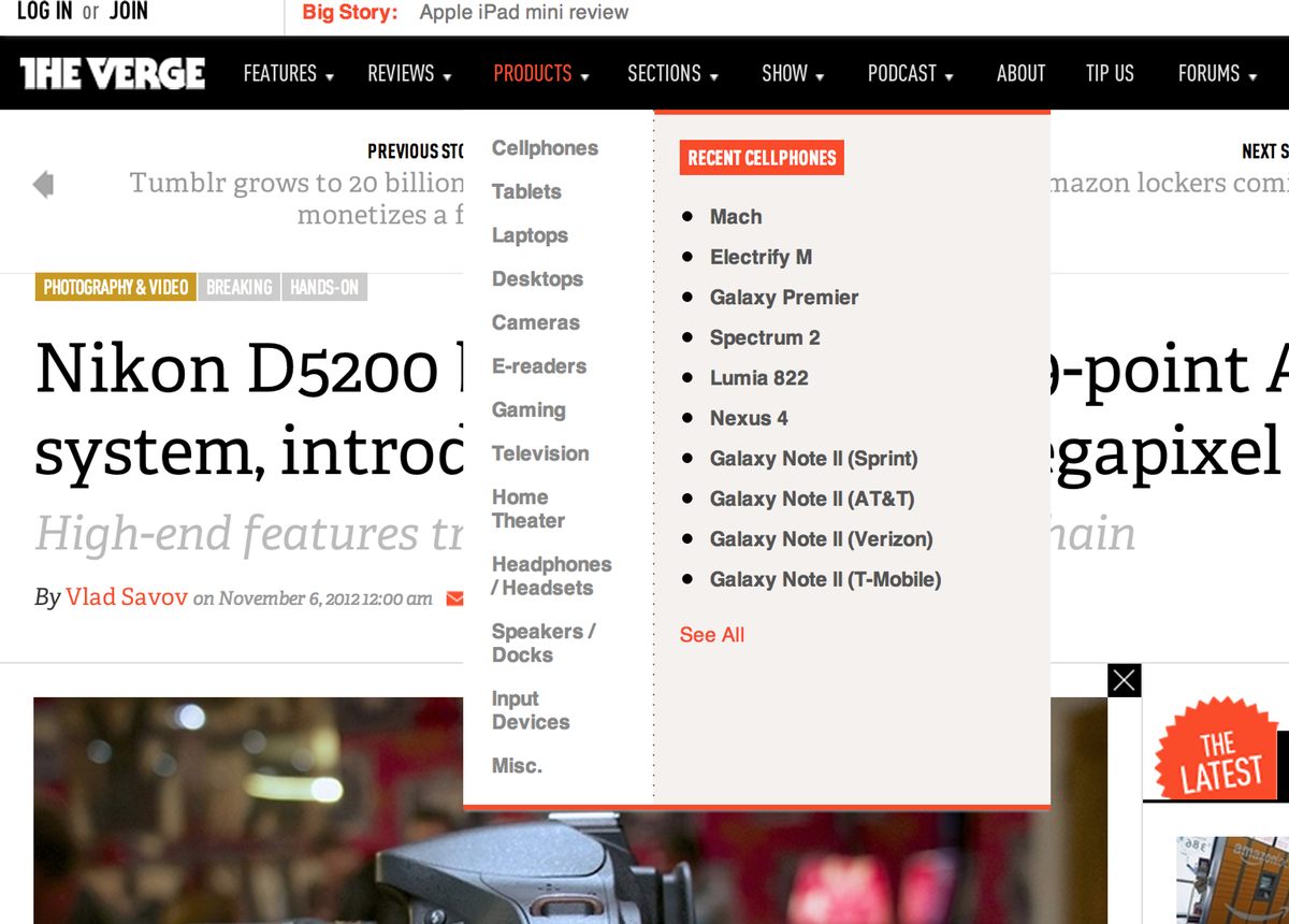
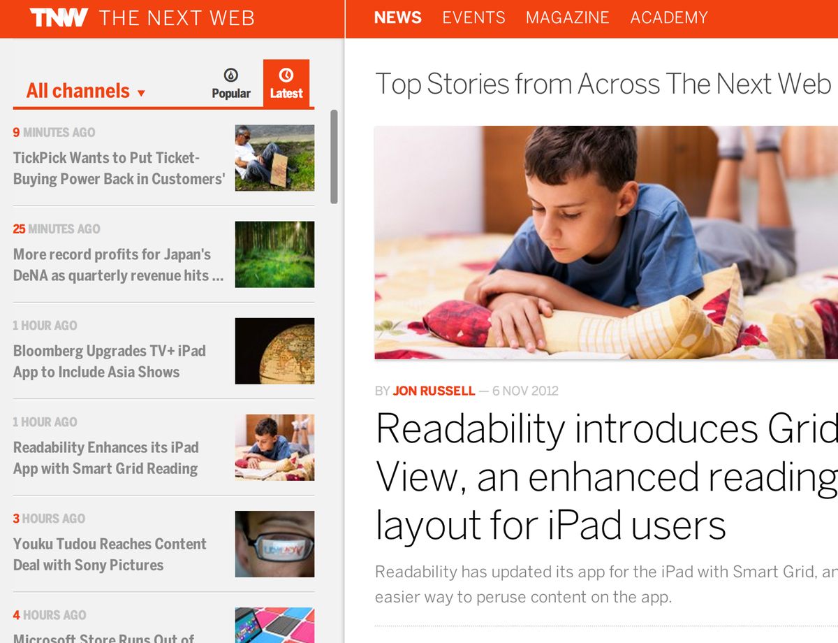
Don’t get me wrong. I actually do like the new designs. I especially love the design on The Verge. It was the first site where I saw orange used prominently. I think other have followed, though I believe that Ars used the orange cycle in its logo for a long time and some of its elements were orange then, but the new design is much heavier on the color. Same with The Next Web. I believe it had more red colors in its old design and certainly not so much of orange.
I wonder if other big sites will follow this trend:

-
Software Architecture cheat sheet
For the past several weeks I’ve been focusing my efforts on learning how to approach software architecture. Despite my experience in developing several applications, I wanted to read and learn more about this to do a better job in the future, for our upcoming project.
I’ve read some articles and a couple of books on this topic. My goal was to extract relevant pieces of knowledge with the final goal of producing one sheet of paper with the most important points. I wanted to stick it onto the wall behind my screen so that I could refer to it with only a glance. It had to have the most important questions that I should ask myself before committing to anything important during software design.
Today, I finally condensed all I wanted to write, prepared this page, printed and glued it to the wall:

I prepared a PDF that you can download and print to put in your workplace if you like this.
Here are the points and their explanations:
Is this a “Good Idea”?
I took this one from Avoid “Good Ideas”
The really insidious thing about “good ideas” is that they are “good.” Everyone can recognize and reject “bad” ideas out of hand - It’s the good ones that slip through and cause trouble with scope, complexity, and sheer wasted effort incorporating something into the application that isn’t necessary to meet the business need.
In other words, think if this is necessary or is it just feature creep. Software complexity increases exponentially so having twice the features makes the code complicated by much more than twice.
DRY. Don’t Repeat Yourself
DRY is a well-known software design principle. Explained in Pragmatic Programmers, it means that “Every piece of knowledge must have a single, unambiguous, authoritative representation within a system.”
I already have an ingrained instinct about DRY. Still, I wanted to have a good in-the-face reminder so as not to forget it in a middle of a passionate idea.
Orthogonal?
In other words, how independent is this module or block from other parts of the system? Modularity in software is important. It makes life easier later. It’s easy to understand and easy to overlook.
Testable?
Think how you will test this part of the system. Is it designed in such a way that makes testing easy? Testability depends on modularity, complexity, code style. Don’t neglect testability of your system or code. Testing is important. Manual testing is good. Automatic testing is much better.
Is there another way?
This is also from Pragmatic Programmers. It contains good quotes in every chapter. Here’s one by Emil-Auguste Chartier — “Nothing is more dangerous than an idea if it’s the only one you have.”
Often, when thinking about problems we come up with a solution and run to implement it, feeling happy that we have one. Unfortunately, often the first solution won’t be the best. Think again, be creative, try a different approach. When you come up with more ideas, it will often be the case that the first one was too rushed and that the next ones are, in fact, much better.
Costs of changing this later
Consider the decision you’re about to take. What will it cost you to change it at later stages of the project? Can you defer this decision? If you’re not sure about the decision, can you design the system in such a way that changing it later will not break things and cause unnecessary work?
What if I didn’t have this problem?
This one is from Don’t Be a Problem Solver.
Because architects tend to immediately enter problem-solving mode, we forget, or rather have never learned how, to interrogate the problem itself. We must learn, like a telephoto lens, to zoom in and zoom out, in order to ensure the question is really framed properly, and that we’re not merely accepting what we’re given.
Instead of immediately working to solve the problem as presented, see if you can change the problem. Ask yourself, what would the architecture look like if I just didn’t have this problem? This can lead ultimately to more elegant and sustainable solutions.
What are facts and assumptions? Document rationale.
The last two are from Challenge assumptions - especially your own.
Best practices in software architecture state that you should document the rationale behind each decision that is made, especially when that decision involves a trade-off (performance versus maintainability, cost versus time-to-market, and so on)…
This practice is valuable because by way of listing these factors, it helps highlight assumptions that the architects may have that are affecting important decisions regarding the software that is being designed. Very often these assumptions are based on “historical reasons”, opinion, developer lore, FUDs…
In other words, if you’re designing software architecture, write down why specific decisions are made and then think what of these are facts and what are assumptions. Check your assumptions.
Facts and assumptions are the pillars on which your software will be built. Whatever they are, make sure the foundations are solid.
Download the PDF with these question to stick on your wall.
Jacob. I’m @jacobgorban on Twitter
-
I think I have a million-dollar idea
Late night two days ago, before retiring to bed, I went to the bathroom, as usual. Suddenly, right there, an idea hit me, which is not as usual.
Moreover, the idea itself is not a usual one for me. It had nothing to do with computers or high-tech, for that matter. It was about the light switch to the bathroom.
You see, I have two kids. One of them is now 4 years old. She feels old enough to go to the bathroom by herself. In fact, she can do the whole procedure herself. Except one thing. Turning the lights on and off. So it happens like this:
I’m half-lying comfortably in our bean bag chair, minding my own business. She comes to me and notifies that she wants to pee. I say “Sure, let’s go”. “No, I’m big enough, I can go myself!”, she replies. I feel lucky that I no longer have to get up from the bean bag chair for this, because it’s quite an exercise, in fact. She feels grown-up.
So she leaves, arrives to the bathroom and calls me from there: “Light!”. Oh, man.
So I had this idea about designing a light switch that usually looks and behaves like a regular one. But, when you have such kids at home, you can pull a rope from there that will allow the them to pull it and turn the lights on and off. There are “pull the rope” switches like that available but I never saw one integrated with a regular light switch, so that both parents and kids could use it. And it should be retractable into the switch when the kids grow, for esthetics.
Yes, I know that kids can stand on a short footstool to make themselves high enough to reach the regular switch. Yet it’s not so comfortable. She needs to carry it between the rooms. Yes, there’s the same problem with her room lights as well.
As far as marketing of this special switch — when the expecting couple comes to the baby store to buy the needed stuff for the upcoming baby, have the seller propose these switches to them along with all the other stuff that they buy. This way they’ll be ready to pull the rope on the first “I can go to bathroom alone”.
And the kid will also feel more empowered since she doesn’t need to ask for your help and spoil her achievement.
So here, take the idea and make a million bucks if you believe it’s worth it. I don’t know anything about designing, manufacturing and selling commodity hardware. I’m just a software guy. Pressing keys on the keyboard is all I know.
-
Using multi-resolution TIFF files with WebKit on Mac for Retina support
I’m working on Retina support for our Mac application Trickster. Most of the things are pretty standard - either creating PDF images instead of PNGs or creating two PNGs for regular and @2x image.
During the build process the latest Xcode will take the two PNGs and create one multi-image TIFF file which is inserted into the built application’s Resource folder.
Trickster uses WebKit to display its Help screens. Two are just text but one is an image.
Previously I only loaded the image directly, without HTML with:
[[NSBundle mainBundle] URLForImageResource:@"Trickster Help"];To support Retina version of the image, I created the @2x version, added it to the bundle and went to look how to use the media queries and other CSS tricks to display the double-resolution image on Retina display. I had to build an HTML file and load it into WebKit instead of the PNG:
[[NSBundle mainBundle] URLForResource:@"Trickster Help" withExtension:@"html"];I built the HTML:
<!DOCTYPE html>
<html>
<head>
    <style type="text/css" media="screen">
    body { margin:0 }

    div#help {
        width: 740px;
        height: 562px;
        background-image: url(Trickster%20Help.png);
        background-size: 740px 562px;
    }

    @media screen and (-webkit-min-device-pixel-ratio: 1.5), screen and (min-device-pixel-ratio: 1.5) {
      div#help {
        background-image: url(Trickster%20Help@2x.png);
      }
    }

    </style>
</head>
<body>
    <div id="help"></div>
</body>
</html>
It worked great when I checked it in the standalone Safari. Safari even dynamically substituted the image used based on where the window was when I dragged it.
The problem was in the built application. The PNGs are converted to TIFF, by default, and the HTML can’t find them so it doesn’t display anything.
I thought “OK, I’ll just change the CSS to point to TIFF image”. Then I thought - but I only have one TIFF, what do I put in the media query?
The solution was unexpectedly simple: point
background-imageURL to the TIFF file and don’t use the media query at all. WebKit handles the double-resolution TIFFs automatically and selects the Retina version when the window is on the Retina screen and regular one, when on regular screens. Yes, it even does that dynamically when dragging Trickster’s help window.Here’s the final HTML:
<!DOCTYPE html>
<html>
<head>
    <style type="text/css" media="screen">
    div#help {
        width: 740px;
        height: 562px;
        background-image: url(Trickster%20Help.tiff);
        background-size: 740px 562px;
    }
    body {
        margin: 0;
    }

    </style>
</head>
<body>
    <div id="help"></div>
</body>
</html>
To sum it up — using WebKit with Retina images inside your Mac application becomes very easy. It just works if you point your HTML to multi-resolution TIFF files instead of PNGs. And Xcode generates these TIFF files by automatically. Easy win!
It’s probably not an appropriate solution for general Web use as I don’t think that other browser will support multi-resolution TIFFs. It also requires visitors to download large TIFFs even if they don’t use them (and let’s not forget - most people don’t have Retina displays).
I wonder if a similar solution works on iOS. I haven’t tried. Would love to hear result, if you try it.
You can get in touch with me on Twitter at @apparentsoft.
-
Using dictation software to study foreign languages
There are many ways to study a foreign language. Books, private teachers, reading, listening, watching movies, writing articles are all valid strategies. But if you don’t live in an environment where the language isn’t spoken by its native speakers, you may have little speaking experience.
English is not my 1st language. In fact, it’s more of a 3rd one. But I do most of my work in English. I read articles and books, listen to podcasts, give interviews, write articles, talk to colleagues and speak at conferences. Still, I don’t speak English as much as I’d like to.
Last year I had a neighbor who emigrated from the United States. He wanted to study Hebrew and I wanted to practice my English. So we arranged to meet a couple of times each week for an hour or two. During the meetings we’ll talk English half the time and Hebrew the other. Later he left our neighborhood and I started to look for other solutions.
What I started to do is using dictation software on my Mac to write articles, reply to support requests and sometimes even for e-mail. I’ve also started to do the same on the iPhone and the iPad.
Dictating text instead of typing it has several benefits as a language study tool:
- it teaches and trains the correct pronunciation of words
- it forces to improve the accent
- it improves enunciation
- it can help with the fluency of speech
Of these, I find the pronunciation and accent aspects the most beneficial.
Dictation solutions
There are dedicated dictation software applications available for Macs and PCs. The best ones are available from Nuance. These are full-featured applications, they process your speech locally on your computer and they adapt to you. You can teach them both your vocabulary and train them to recognize your voice. They are not cheap, though.
The other solutions use cloud services to send your recorded speech to some servers that process the recording and send back the transcribed text. This is how dictation works on iOS devices and in various solutions by Google, including Android phones, Google voice search and Google Translate. These solutions are a little slower and require an Internet connection.
One interesting benefit of cloud solutions though is that they don’t adapt to your specific accent and speaking style. The cloud solutions assume a “standard” accent. In some cases, like on iOS, you can choose which accent you use to speak (American, UK, Canadian etc). But that’s the only configuration option available. This puts even more “pressure” on you to speak with the correct accent and improve your enunciation.
Of cloud solutions it seems that Google recognizes the most languages including Russian, Polish, Turkish, Arabic languages, Hebrew, Chinese, Dutch, Portuguese, Korean and more. You can download the Google Translate app for iOS and see exactly which languages it recognizes. Unfortunately Google Translate web site only appears to support English dictation for some reason.
To sum it up, if you’re studying a foreign language consider using the multitude of the available dictation solutions to train your speaking abilities in that language.
This article was dictated using Dragon Dictate for Mac from Nuance with some editing done later in the text editor.
-
Think it later
I love the concept of “read it later” services. Whenever I hit something that is too long to read at that moment I send it to Instapaper. Later, when I actually have time to read, I launch Instapaper app and see the list of the articles that I queued for reading.
In my previous article, “Thinking time”, I described how I love to schedule dedicated time for thinking about my business. Sometimes, though, the time comes and I’m not sure what’s on my agenda.
So lately I’ve come up with a concept of “Think it later” notes. The idea is so simple that it’s embarrassing. During the week, whenever I get a thought that requires time or depth of thought, I add it to “Think it later” list. These notes are then my “thinks to do” during the “Thinking time”.
Technically, you can use anything for your “Think it later” notes. It can be your favorite note-taking application on your phone, plain pen and paper, or you can use your favorite to-do application. If you use a system based on GTD you can create a special context called “Thinking” and use it for this purpose.
Even if you don’t set a dedicated time for thinking you can refer to this list whenever there’s some time that you can use for this purpose.
If you like this idea but not sure how to implement it, just write it down and think about it later.
subscribe via RSS